 INTERNATIONALWEEK
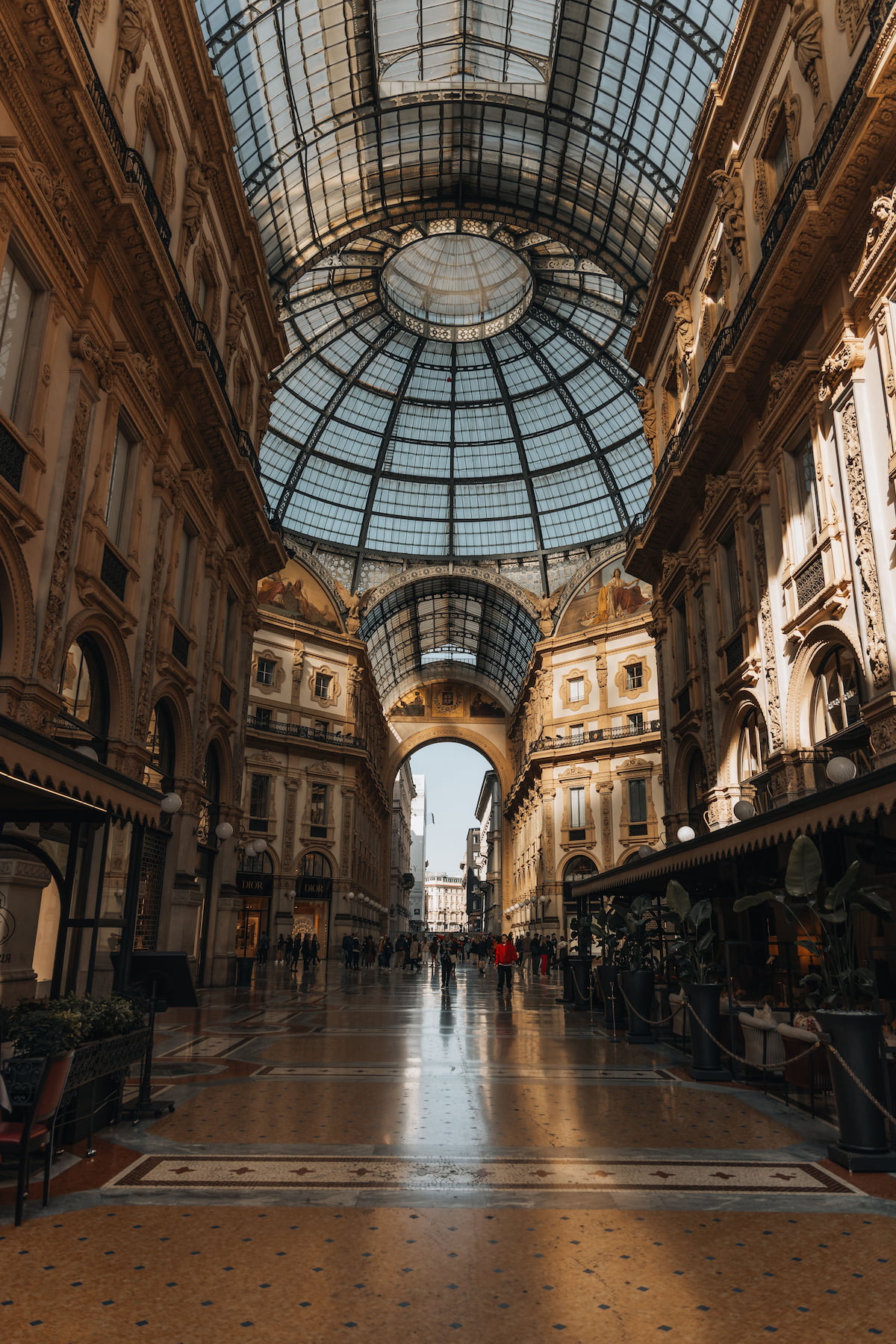
One united community
INTERNATIONALWEEK brings the many cultures of Milan together into one community for young people of every background. The app is the digital front door to that mission: discover places, join events, collect points, belong.
Mission — Help international students integrate into Milan life from day one.
Audience — Students aged 19–25, new to the city, hungry for connection.
Promise — Your friend in Milan, not just an events listing.
“Tonight in Sempione — meet 200 students.”
“Please find herein the upcoming networking opportunity.”
The circular mark
The full badge — an “IW” monogram inside a coral disc, ringed by the INTERNATIONALWEEK · MILAN orange band — is the primary logo. The coral inner circle stands alone as the app icon.
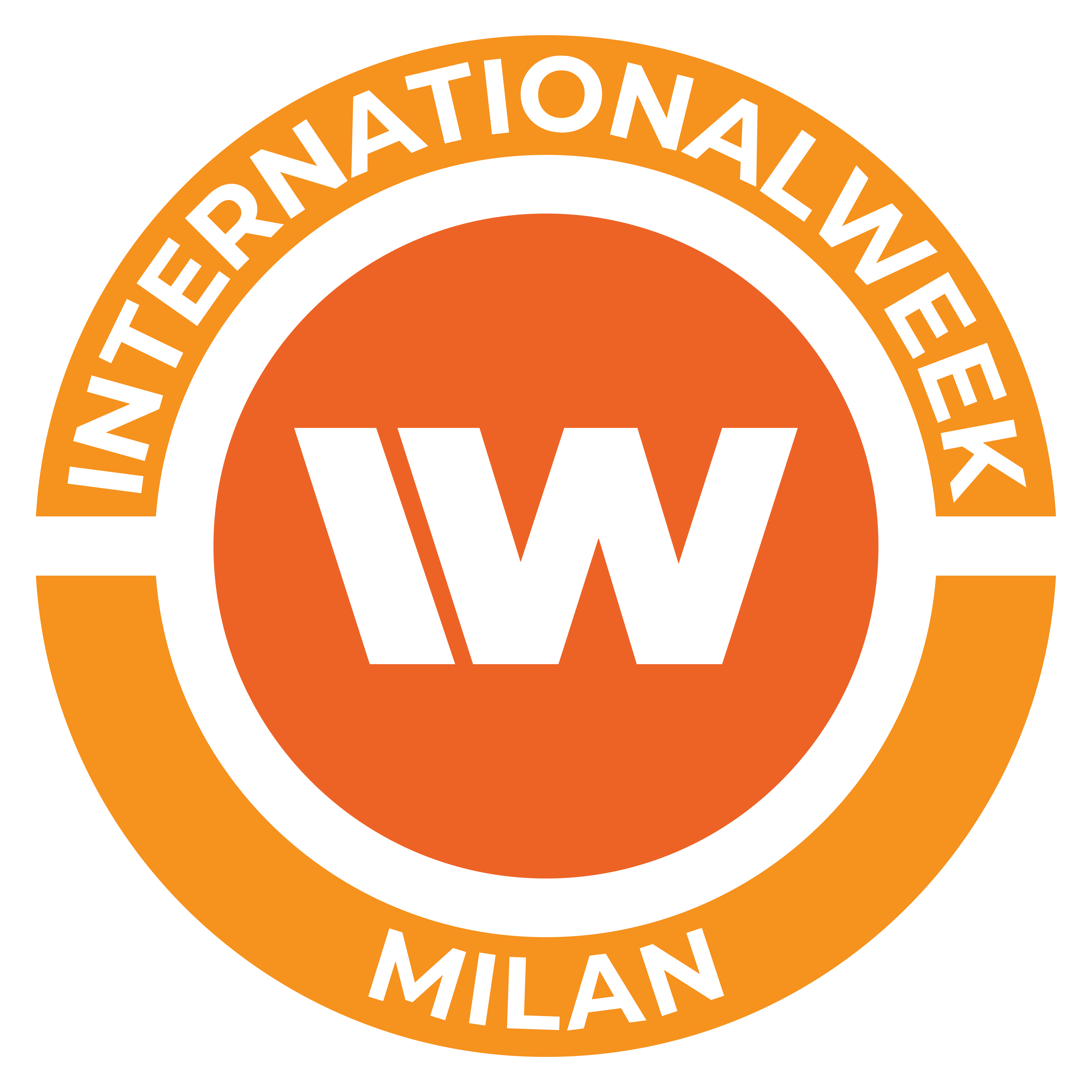 Primary badge · full lockup
Coral “IW” inner circle — used for the home-screen icon, avatars & favicons.
On light
On dark
Keep clear margin equal to the orange ring width on all sides.
Don't recolor, rotate, stretch or detach the ring text from the disc.
Milano Coral & warm neutrals
Coral is the action color — primary buttons, active states, links, points and badges. Never a filter over photography. Use #D3501F (600) for text/links on white to stay AA-legible.
The warm orange from the logo’s outer ring. Pair it with coral for badges, highlights, points & celebratory accents — a half-step lighter and brighter than coral, it keeps the brand energetic without competing with the primary action color. Use sparingly so coral stays the call-to-action.
Two intentional tiers: the brand oranges (Coral + Marigold) carry identity & action, while these six tag content categories one notch quieter — all at oklch(0.66 0.116 ·), varying only in hue — so they never shout over a coral button. Events shares Coral’s hue at this calmer tuning. Home & Places are destinations (tabs), not categories — they carry no accent. For small text on white, drop to oklch(0.52 0.13 ·); for badges over photos use oklch(0.6 0.13 ·).
Aleo + Plus Jakarta Sans
Display & headlines. A warm slab serif — friendly, characterful, with a confident editorial voice.
Body & all UI. Friendly humanist sans — warm, highly legible at small sizes.
Rounded line icons
1.8px stroke, rounded caps & joins, on a 24px grid. Ink by default; coral only when active.
Natural photography
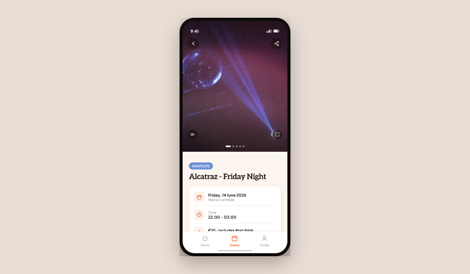
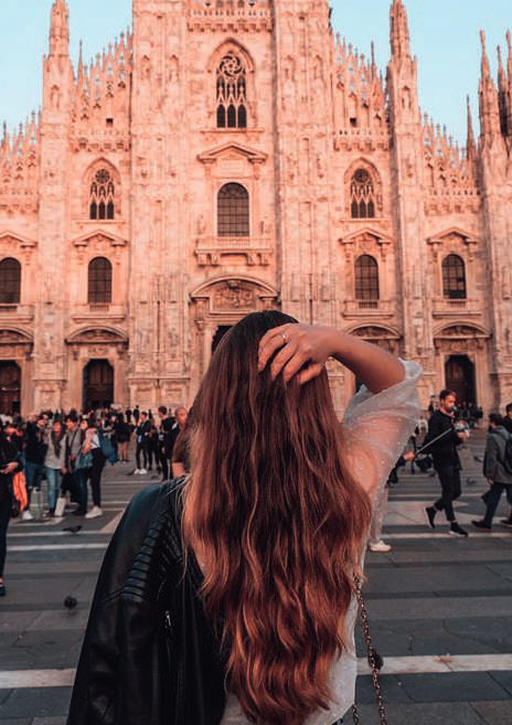
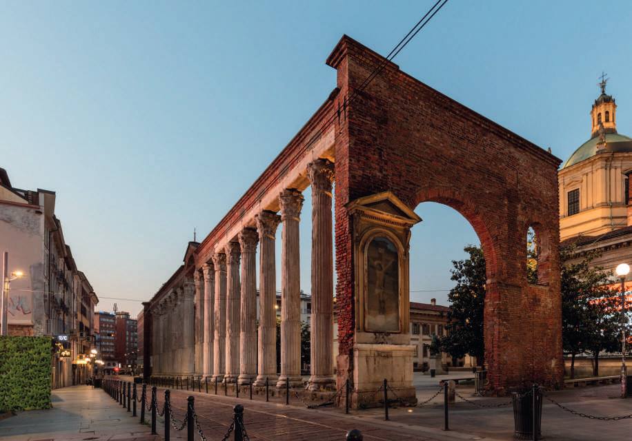
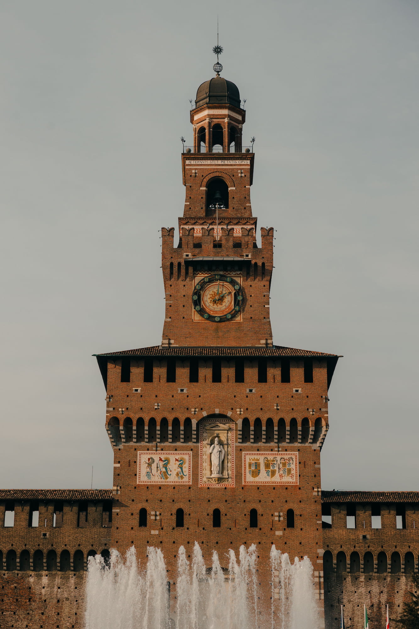
Real Milan, in real colour. Photography carries the warmth of the brand on its own — no tint, no wash, no filter. Coral stays where it belongs: in the interface, on top of the picture.
- Real Milan, real students — people and street life over empty landmarks.
- Warm daylight and evening light; keep skin tones true.
- For text over a photo, use the scrim gradient only:
linear-gradient(transparent 35%, rgba(20,10,5,0.7)). - Let coral appear as UI on top — pills, chips, buttons, badges.
- No coral wash, duotone, grayscale or blend-mode tinting.
- No heavy filters, vignettes or Instagram-style grading.
- Don't flatten a photo behind a solid colour panel to make it "on brand".
- Don't place text straight on a busy photo without a scrim.
Core kit
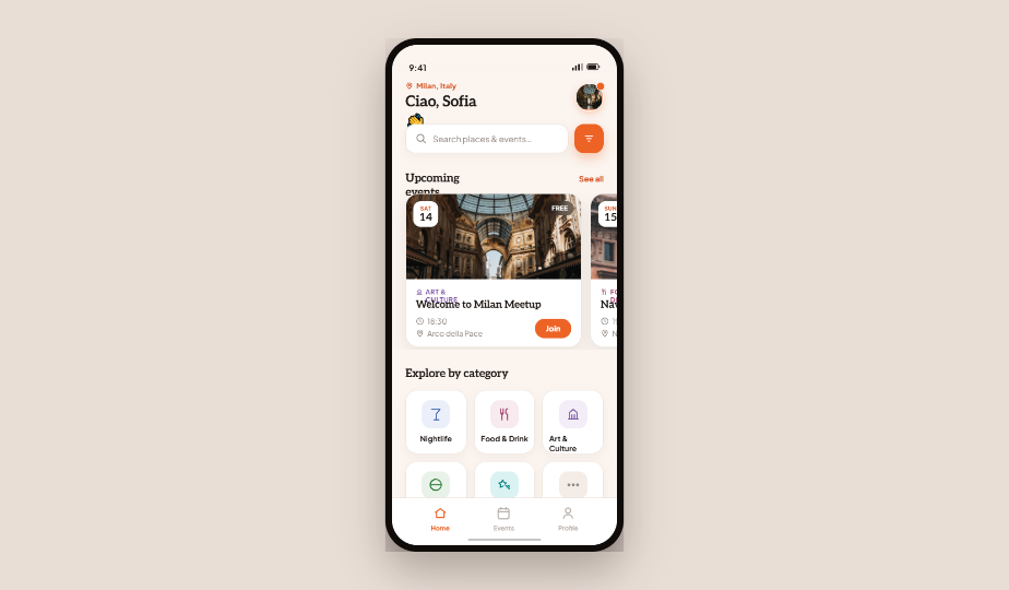
The event card is specified in full in section 08.
One card, every placement
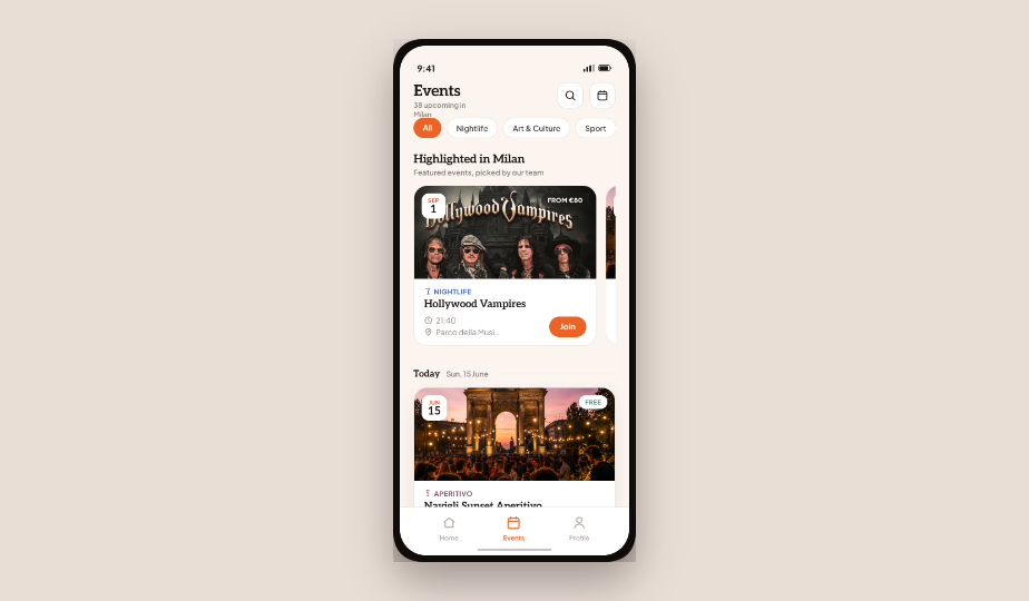
Events are always presented with the same card. Only its width changes: full-bleed in a day list, 296px inside a horizontal highlight slider. Never two cards side by side — a day can hold a single event.
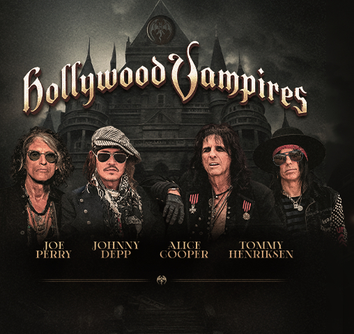
Highlighted in Milan
Featured events, picked by our team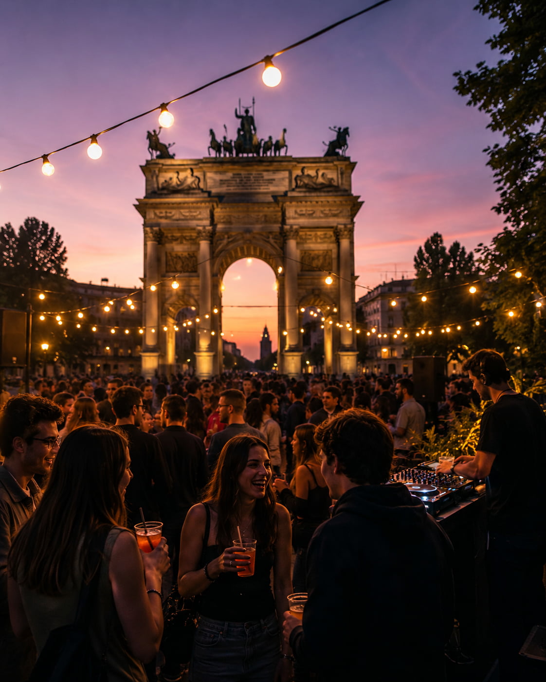
Staff-curated row. Always led by a section header that names the rule behind the selection; drag or swipe horizontally, snap to card start.
Day list. One column, 14px between cards, grouped under a date rule — so a day with one event still reads deliberately.
The system, applied
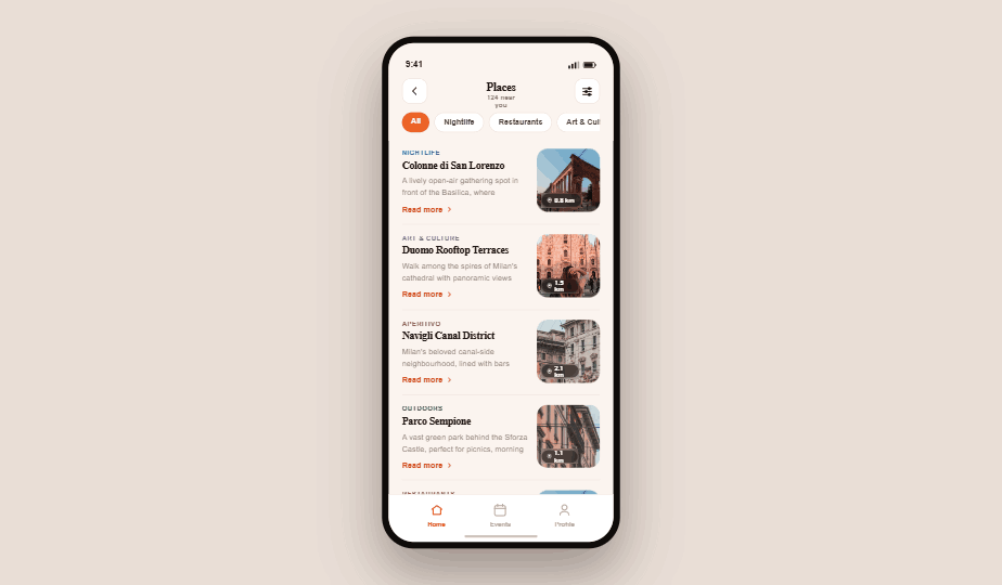
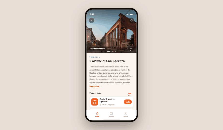
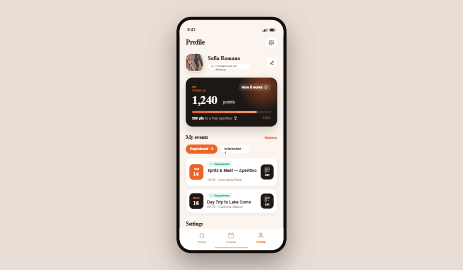
The live screens, not mockups of them. Open any one to see the tokens, icons and cards above doing their job — if a screen and this document ever disagree, the screen is what shipped.